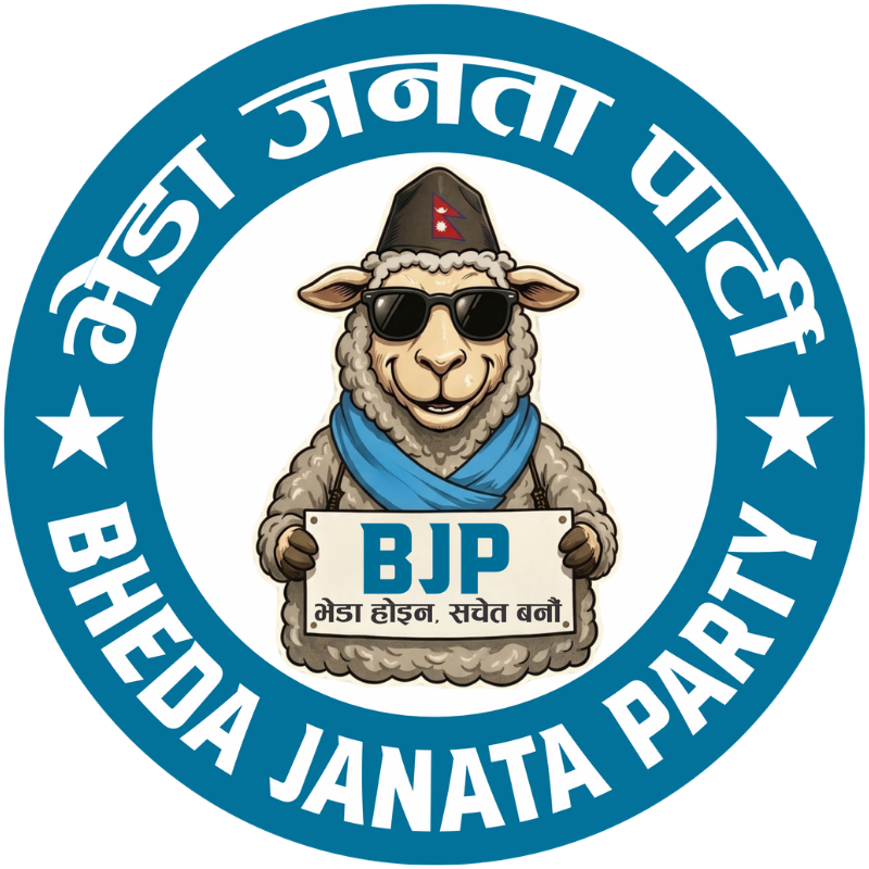

Introduction to the Bheda Janata Party
The Bheda Janata Party (भेडा जनता पार्टी – bjp) aims to provide a fresh perspective on political branding through its satire on herd mentality and blind political following. Focusing on a clean, bold, and minimal aesthetic, the party identity will attract an audience that appreciates sharp modern design while engaging with crucial political themes.
Logo Concepts and Visual Elements
The primary logo idea for the Bheda Janata Party features a stylized sheep icon donning sunglasses, standing confidently at a podium. This imagery encapsulates the party’s message, combining humor with political commentary. The use of colors like orange, black, white, and dark navy adds vibrancy while maintaining a professional appearance. Complementing the primary logo, monochrome and inverted versions ensure versatility across various media.
Typography and Brand Identity
Typography plays a pivotal role in the party’s branding kit. The choice of a bold, modern sans-serif font echoes the clean lines of the logo and provides readability across various platforms. Additionally, simple brand icons representing themes such as awareness, thinking, herd mentality, and voting enrich the identity system, allowing for a consistent visual language. The slogan, “भेडा होइन, सचेत जनता बनौं”, reinforces the party’s ethos, encouraging voters to transcend blind loyalty.
Overall, the Bheda Janata Party’s branding kit is designed to be mobile-friendly, sharp, and deeply professional, effectively engaging the electorate’s focus on contemporary political issues while evoking thoughtful discourse.